Sometimes Cards may roll over from Run to Run without ever getting the attention they need. Often this points to an underlying issue like missing information, unclear assignment or lacking resources. Among many Cards in a Run, it is easy to overlook these.
To help you identify these cases, we’re introducing our new Beast Mode system for teams on our Pro
plan! Once you enable Beast Mode, Cards that don’t reach completion by the end of a Run, will be highlighted with a new Beast Level marker. A Beast Level increases every time a Card misses its target of being done by the end of a Run.
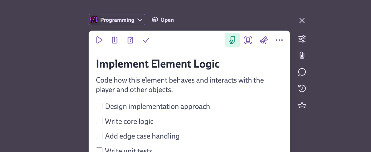
You can customize how the Beast Mode works by clicking the new Beast icon on the header bar of each Run:
This is a new feature we’ve successfully tested internally to better identify those annoying stalling Cards that aren’t making progress repeatedly. This allowed us to reassess these Cards, fill in missing information and clear up confusion. We’ve also added sorting and searching options to quickly find Beast Cards.
Having the Beast level tied to a Card may feel a bit direct, so we’re looking for your feedback regarding how these feel. We believe this feature can help bring attention to Cards that need more support and ultimately improve progress in a playful way — just as you know us. Now go ahead and squash those Beasts before they level up further!
More information can be found in our Manual.
Hey Codeckers! Whether you’re navigating through sidebars, organizing your Journeys, or fine-tuning your Runs, we’ve got some big improvements that will make your workflow smoother and more magical.
We’ve given one of the core elements of Codecks a significant upgrade! The sidebars now slide in as overlays rather than displacing content. Here’s why that’s awesome:
And since conversations haven’t seen a design update in years, we gave it fresh coat of paint as well.
We’re eager to hear what you think of this new experience!
Journeys just got a turbo boost!
This opens up all sorts of new possibilities, like:
Journeys have always been magical, and now they’re even better!
Our Run feature has been leveling up with these handy new options:
Shift+S
to quickly set a Hero card for the one you’ve got open.!
during card creation.You have been asking for them for a long time: This release finally brings our own support for Runs (a.k.a. sprints)! And on top of that we have a ton of usability improvements making you go even faster. 🚀
You can now add Runs. These are automatically recurring milestones — in other tools often called sprints or cycles. The term ‘sprint’ comes with a bit of implied baggage and since we wanted to create our own interpretation, we decided to use a different terminology, inspired by sprints and dungeon runs. 🏃🏽
These Runs are shown as bars within the Timeline. You can set up multiple Run configurations at once and set the following properties:
Runs not only save you a lot of busy work, but help you segment your work further. You can assign Runs and Milestones independently to any Card. This way you can plan your weekly progress towards a big release Milestone. Or track different Milestones initiatives in the same weekly Run. We made the setup as flexible as possible.
Some more highlights about this new feature:
We completely reworked mouse and keyboard shortcuts in Codecks, making them faster to use than ever before. Now all shortcuts are easier to access and use the awesome quick settings panel, which can be completely navigated by using mouse or just keyboard.
shift + d
). The overlay also allows you to directly create new Zones. A button on the bulk action bar was added as well.b
to x
(after all x looks more like the selection icon).j / k
or arrow keys works much more reliably now and even when having multiple Cards selected.cmd/ctrl + enter
now saves the Card, even if the focus is outside the text editor.We can’t wait to hear what you’ll think about this update. Let us know on our discord community server.
Danke schön! With love from Berlin. 💜
In this release, we focused on improvements for milestones and for tracking work. This is part of a bigger initiative to improve big-picture planning and tracking within Codecks. We’re excited to bring you more tools to plan your project from start to finish.
The milestones tab now features a redesigned, sleek, dark-themed area. We’ve switched to a week-based timeline scale so you can see more upcoming milestones at once. Calendar and milestone overviews are now easily accessible via two new buttons in the top right corner and appear as overlays. The calendar sidebar now also displays week numbers.
Milestones now feature a capacity tracking widget which you can access from the milestone sidebar. The widget shows how work is distributed across your teammates. You can also set the individual capacity of each team member to highlight members that might be overbooked or out of work. The milestone header also shows your individual capacity at a quick glance.
We’ve revamped the milestone info you see when hovering over a milestone icon or in the milestone sidebar. We got rid of the confusing and hard to find card-based or effort-based counting toggle. The new milestone info combines the best of both worlds: card icons show individual card counts per type, and an expanded horizontal bar shows total progress based on card effort, including blocked, reviewed, done, and other cards. The bar also shows current team velocity and overall milestone progress. We also updated the burn-up chart styling for better readability. A new organization setting was introduced which allows to pick a fallback effort for cards with no explicit effort.
New milestone icons make it easier to distinguish between past and upcoming milestones. Past milestones now only have an outline while upcoming ones are filled.
We added activity streams to the milestone and deck sidebars, keeping you up-to-date with current events without having to switch into a different view. To see the full activity stream - including the ability to filter for certain activity types - you can jump into the full activity stream view as previously. We also redesigned the activity items to make them a bit more compact and quicker to read.
We’re putting the final touches on our upcoming support for sprints. Since a card can be assigned to a sprint and milestone at the same time, this will also improve long-term planning in Codecks, allowing you to have recurring sprints while tracking overall progress towards a release goal. You can expect this update very soon.
The property panel has a new, modern look. The milestone picker is now a list, showing more of the milestone name and target date. Not seeing the right milestone in the list? Just click the ‘pick’ button to open the new milestone selection. The new menu can also be quickly navigated using the keyboard, allowing access to previous milestones and other card properties.
Previously, hero cards were automatically set to done once all the sub cards were done. This was not always the desired design. Even worse, a hero card that went into done without anybody noticing, could result in the hero card being auto-archived and seemingly disappearing. Some users avoided this behavior by adding placeholder sub cards.
Instead, hero cards will now never be automatically set to done. To set a hero card to done, use the new done button, which can be pressed once all the sub cards are done or archived.
We improved the readability of the table mode, by tweaking font sizes and reworking how hero card titles are condensed. Additionally, the table columns will now automatically adapt to your view pane, dropping columns to maintain readability if necessary. We also added the ‘quick add’ feature to more sorting options of the table view. Table view is a pro feature.
Let us know what you think about the release, and let your friends and peers know about Codecks. This is the best support that we can get towards building the best project platform for game devs.
Danke schön! With love from Berlin.
We’re starting 2024 strong with a big update! A lot of these come from direct feedback that we’ve heard from long-time users. We’re working hard on making Codecks even better for you. And of course also for all the new Codecks users that have discovered us recently. Great to have you with us! 👋
In the past, we’ve recommended creating multiple projects per game to improve the structure, but that is not necessary anymore. You can now create spaces to group your project decks.
While working on the decks tab, we’re also introducing the following:
As teams grow, the need for supervision may increase. So we came up with fairly unique twist: you can now declare Guardians on a per-deck basis.
Guardians are automatically added to any review happening in that deck. A card can’t be set to done without going through a Guardian review. Guardians are also the only ones that are allowed to archive, delete or move cards within that deck - besides producers and admins.
We’re also testing a new, more explicit review flow here. In decks with Guardians, the opt-out button becomes an ‘approve’ button. Card owners will only be able to mark the review as successful if all Guardians approved the review.
This mirrors the way that regular reviews are most commonly used, and we decided to make this framing a bit more explicit. If successful, we will likely also revisit regular reviews and look into making their usage a bit more clear.
Decks without Guardians are working as usual. Guardians are a Pro plan feature, as they are aimed at bigger studios that need the additional support to control their workflows.
We know you love your card cover images! Codecks now offers you more control for how a card’s cover image is presented.
We want to make Codecks a welcoming home where newcomers on your team find their bearings easily. To allow you to show explanation texts, we added support for bigger deck and milestones descriptions, in the previous release.
We’re extending this feature further:
You can save your sort options on a per-deck basis, but the UX for this was a bit harder to grasp than we wanted. The default viewing option would be marked with a star and if you would diverge from the default view, a reset-view button would show up next to the search field on the other side of the screen.
We’ve reworked this feature by adding a ‘Default View’ panel below the sorting options. From here you can easily save a new default view or reset your view. All in one place! If your current view setting differs from the suggested default view, we now show a green dot on the sorting button to let you know.
We hope you like the new release!
2023 is wrapping up, but we couldn’t let the year end without another major Codecks update! This is our 8th major release this year.
Since their introduction in 2020 Hero cards have become a core component of Codecks and with we’re looking to make them even easier to handle.
We have a new global sidebar design which aims to improve two challenges:
The info toggle (right below the add-card button) lets you enable an info sidebar that is always shown when no card is currently opened. This reduces the occurrence of card reshuffling dramatically.
We use that space now to prominently display your beautiful milestone or deck description text. Use this area for nice lore text, rallying cries for your release milestone, or to document how this deck or milestone should be used by the team.
Additionally, we’ll show you a quick overview for all the cards in this context. And if you’re looking at a milestone, we even show you the card count progression over time.
We worked towards making Codecks even more playful and appealing to look at:
Our trusty Decky bot is great for collecting feedback and bug reports from your own Discord community.
We recently released a huge update for our free Steamy bot. Steamy allows you to post any new reviews of one or multiple Steam games to your discord server. This is great for showing your appreciation for good reviews and motivating your community to leave more.
All non-English reviews are now automatically translated to English for your convenience. Also, the bot now supports posting weekly summaries which shows how reviews have affected your overall rating in this week. To add Steamy to your discord server, simply navigate to this page: Install Steam Bot
/
) in cards or descriptions no longer open a new tab.We want to a moment to thank the participants of our first intimate Codecks Conf in November! We had a blast and hope to make this a recurring event. As a special treat, we showed some upcoming ideas and concepts that we’re currently investigating and even held a (totally not statistically representative) vote on which of these excited the participants the most.
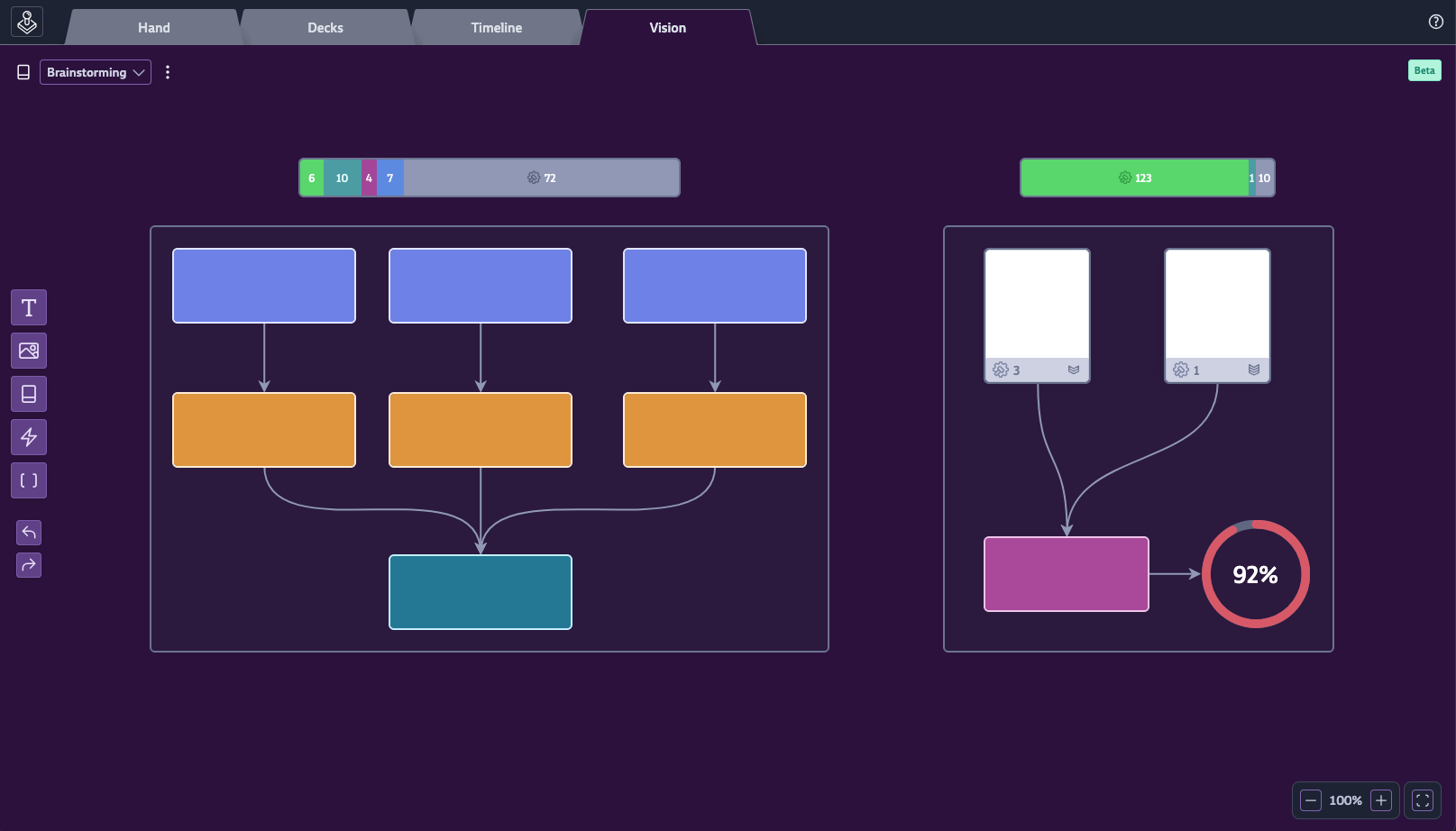
The clear winner was our idea for a new vision tab, which allows you to create a type of skill tree for your game project. You can freely lay out the most important aspects of your game in a one-page format, allowing you to have a quick grasp of its overall progress.
We’ve already started implementation on this new big feature, and we’re excited to share more about it in the new year. This will literally be a game changer.
Thanks for everybody that supported us in 2023! We’re still a tiny team taking on the outdated juggernauts of the industry with the mission to create a better alternative for creative teams that need easy-to-understand, yet powerful tools.
If you want to help us on our quest, the best thing to do is to spread the word! We don’t have a marketing department, so we need your help to let the world know about Codecks. :)
Wishing you happy holidays and see you in 2024!
We love cards! But when you’re dealing with large decks containing several hundred cards (your bug deck 😭) sometimes a super-streamlined view that allows you to quickly scan lots of cards would be nice. That’s why we’re introducing Table View for our Pro Plan!
Find the new view option in the sort panel to the left. The table view supports all the swimlanes and drag’n’drop feature that you already love. Using the ⭐ button you can also set this view as the default view for decks.
This has been suggested on our lovely discord server by Junuh
and Wattosan
. Thank you!
We’re still a small scrappy startup taking on the old boring behemoths in the market. If you want to help us and share Codecks with your friends or colleagues, you can go to your organization settings and look for the “Refer a friend” section. Your friends will benefit from an awesome 10% discount for the first year.
saragtd
).m
, the shown milestones will be filtered by the project the card belongs to.mjeno
).alt-p
to start or stop the current timer. (Suggested by Marek
)HappyPorcupine
)mjeno
).lunar_penguin
)You ask, we deliver! Most of these new features in this release are the direct result of conversations with our discord community. 💜
The new Quick Settings panel allows you to change multiple card properties with just a few keystrokes. Trigger it by simply clicking the effort icon on any card and use the arrow keys to effortlessly update priority, effort, deck, milestone, or owner of a card.
Pending changes will be marked with a dot next to the property tab. Pressing return will commit your changes to the card. Pressing Esc closes the panel without any changes.
Oh, and you can even trigger this panel directly while writing card text by using the /slash command “Set Card Properties”.
A lot of Codecks users rely heavily on hero cards. We love them too! That’s why we’re improving workflows around hero cards by adding a new dedicated sorting order, which allows you to group cards by their hero card. 🤩
We have given the deck overview a remarkable face lift. Leaning even more into our playful card metaphor, decks will now have a depth depending on how many cards they contain.
This depth is taking completed and uncompleted cards into account. Also, the number of done cards within a deck is now proudly shown on the deck cover to help you understand where you’ve already made a lot of progress. The deck depth itself is rendered in two different shades to show the ratio between done and undone cards too.
And we’re finally adding a fan-favorite feature request.. drumroll you can now override the deck colors manually from the deck settings!
In addition to inviting team members via email, you can now also use a convenient invite link for your team. These can be created by organization admins from the user management screen.
e
or p
for editing effort and priority.In our quest to enhance your writing experience, we’ve
completely rewritten our text editor. This allows us to bring you a bouquet of new features.
Our smarter completions for lists or block quotes will save you time, and the ability to indent with tab
/ shift + tab
makes structuring your thoughts a lot easier. The new monospaced font offers more clarity in recognizing indentation levels, too. We’ve also added slash commands (type /
) and a floating action bar, to make our editor and markdown features more discoverable.
When crafting, reading, or editing your cards, why not do so without distractions? With our new full screen Focus Mode, that’s exactly what you can do. To make room for the new focus button on top of cards, we’ve shifted the card Id button to the lower left corner. Enjoy a zen-like experience as you work on your cards.
Previously, the onboarding progress was associated solely with an organization and was only visible to the organization’s owner. Now admins can also participate in most onboarding steps, making the process more inclusive. A cherry on top - if you complete onboarding steps in one organization, they will count as completed in other organizations too!
To ensure you have a seamless experience, we’ve made several key improvements:
alt+x
shortcut to promptly dismiss conversation notifications for an opened card.Enjoy these updates and let us know your thoughts. Your feedback fuels our improvements.
Can never get the card editor size perfect on your screen? Regular mode is too small, wide mode too wide? Now you can freely resize the card editor!
We have spent the last weeks completely revamping our whole text editor. The resizable window is just a first glimpse at the new capabilities that we’ll be sharing very soon cough focus mode cough.
Here are all the changes for this release:
You can now drag the container for an opened a card (or journey step) to your preferred width. 🤯 This width is remembered on your browser, so you can use different settings if you use Codecks across multiple computers with different displays.
We’ve improved the design of the buttons surrounding opened cards. Most importantly, we’ve unified the deck selection flow across card-editing and new-cards. The new deck selector will give quick access to recently used decks and allows you to jump to the full deck picker.
!
opens a grid rather than a list. This allows for more and bigger images being shown.esc
goes back to edit mode rather than canceling the edit process.ctrl/cmd + click
to jump to move the selection to the correct line.The calendar has gotten a big extension! It now offers an “Overview” button which allows you to inspect and compare high level stats over all your milestones.
You can reach the calendar via the expand icon at the top right of the timeline within the Milestones tab.
The overview offers to either use card count or effort as your metric. You’ll find the distribution of completed vs uncompleted work across priorities and owners.
This will be a big assistance in making milestones more comparable and thus more plannable.
To give new as well as existing users a chance to learn about the breadth of features, we’ve added a new onboarding system. Every organization owner has access to currently 70 steps divided into 16 chapters.
To make it more digestible we’ve included a small playful XP and level up mechanic. You can access it via the blue shield icon in the top right.
The progress for existing organizations has been mostly pre-filled so you don’t have to redo steps you know about already.
To be clear, this is just the first version we’re putting out to get some early feedback from you. So if you have suggestions please let us know either via Discord or per Mail!
Hold onto your hats folks! We’re back from GDC and we bring you some exciting changes to Codecks!
We’ve made it easier than ever to jump onboard with our new CSV import functionality. Say goodbye to the headaches of switching between project management tools, because now you can import your projects straight from any tool that supports CSV exporting. You may of course also access our existing Trello and HacknPlan import tools.
And there’s more! Re-import a CSV that is based on an export of your Codecks cards, to update the data of these cards in place. This could be used to perform complex updates using spreadsheets.
The CSV Importer can be found in the Organization Settings. Make sure to check our Manual to learn more.
Now you can create a Codecks account using your Discord or Google login. No more wracking your brains to remember another set of login details - hooray!
We added a new help center section. Just click on the question mark icon next to the milestones tab in the header, and you’ll be whisked away to a wonderland of information. We’re talking manuals, our Discord community, status page, and more. It’s like a treasure trove of knowledge!
!
in the card editor or comment section now shows more and bigger images.ctrl/cmd+a
for selecting all cards. It did not work as expected in some contexts.So, what are you waiting for? It’s easier than ever to get on board with Codecks. See for yourself how magical project management can be! 🤩
Happy new year, dear Codecks users! We’re excited to see the games and projects you’ll be releasing in 2023. To help you with that, we have a biiig update ready for you to use.
When you have a lot of cards inside a milestone or deck, it can be hard to maintain a clear overview, even with the various sorting options that are already available. In this release, we’re adding “Zones”: they are custom card groups that you can add when you’re in the “Manual” sorting order. Zones are shared across the whole team.
A couple of example uses:
There are lots of other possible applications for this, and we’re curious to see what you’ll come up with. Let us know your favorite use case on our Discord server!
Zones can be managed by Owner, Admin, Producers and Staff users with Full permissions.
The new Pinned Milestone section in the Hand tab shows all cards assigned to you in the currently pinned milestone. This allows to see your upcoming milestone work without having to leave the Hand.
You can also easily drag’n’drop cards directly into the Your Hand area or reorder the cards as needed. Zones are supported here as well. The order will also be mirrored in the full Milestone view.
We plan to make Codecks even more playful in the future. In this update, we’re adding a new streak system to your done pile in the Your Hand area. Mark any of your cards as done during a week, and your streak counter will increase by one.
If you’re on the Plus or Pro plan, we automatically freeze your streak for you, and it is never reset to zero.
Hover over the flame to see your previous best streak. The counter will also be featured on your Open Decks page.
Submitting good feedback via our Discord Decky integration will now award you with Karma points and additional roles. Gain 1 point for each upvote reaction to your feedback, and 10 points for each feedback that gets marked as “done” by the developer.
Your karma is displayed next to your submitted feedback and can also be shown with new /karma
slash-command. As a reward, server admins may auto-assign custom roles to contributors that reach a certain Karma threshold.
Additionally, we’re adding the following features to Decky:
Workflow state updates
section of a command. Use this to auto-add your server moderators to new feedback threads.Are you a student based in Germany? Here’s an opportunity to work with us!
Every user can now set a default inbox deck: when creating a new card from the Hand or Milestones tab, this deck will be automatically pre-selected. You can pick your default inbox deck in the the top bar of an opened deck. Hovering over the button will also show you who else is currently using this deck as default inbox.
You might use this to default your cards towards a specific work deck that you tend to work in (e.g. the “Code” deck if you’re a programmer). Or you might use it to default your new cards towards a project inbox from where they are then moved into fitting decks.
Our goal is to make adding cards more convenient and less error-prone. Let us know what you think!
Milestones now support the “Manual” sorting order, which was previously restricted to decks only. We made this the default sort order for milestones.
In order to improve Codecks’ accessibility, we’re introducing three new workflow state color palettes for users with Protanopia, Protanomaly and Deuteranopia. They can be selected from Mission Control > Your Profile. This is a per-user setting.
We also made some slight adjustments to the default palette, most notably unassigned cards have a brighter color than before.
Status
to Workflow state
to be consistent.A couple of updates from teams using Codecks:
A lot of us are using Codecks to not only track tasks, but also game design documents and other reference material. With $-links and backlinks you can already build pretty complex wiki structures. To support this use case even more, we’re adding a new card type: Doc Cards.
Turn any card into a doc by clicking the new Doc icon on the bottom right side of an opened card (or use the bulk action bar to convert multiple cards in one step). A Doc Card is like a regular card but does not have workflow states, priority, or effort. This means no more accidentally setting document content to done and archiving it.
We’re currently conducting a lot of customer interviews to check in on how you use Codecks. One outcome has been that notifications can pile up a bit in certain situations. So we’re introducing a few changes:
watch
👁 button has moved from the history panel to the bottom right of the opened card.$
prefix) to open that card directly.As your team grows, you will need finer user access control options. This release features a big extension of user role management.
Staff
users access can now be limited to specific projects. The old Guest
role has been removed as Staff covers the same functionality now.Producer
role for specific projects. Producers may manage decks, milestones, project users and integrations. Think of this as a project-specific admin role. Producers are available on the Pro plan and can be added in a new section of the project settings called “User Access”.Admins
can now choose to limit the Staff role from creating and manage decks, milestones and journeys.Full Team
or Limited
. The Limited setting is available on the Pro plan. All organizations created before this release have access to this setting as well.Owner
role was introduced. There may only be one Owner and only they are able to close an organization.Here is an overview of the most important permission changes:
To learn more about the user management system please read our manual.
Staff
role have the same project access as before. Guests
have been automatically converted to the new Staff role.Admin
user who has been member of the organization for the longest has been turned into an Owner
.Limited
. All others have Full Team
access.Full Permissions
, meaning they can still manage decks, milestones and journeys like before.done
interaction..
as shortcut for bookmarking cards. This shortcut can be applied when hovering over a minicard, when looking at a opened card and when using the multi-select feature. To view a list of all available shortcuts in your current screen press ?
on your keyboard.-
,_
and .
$123
) followed by punctuation are now correctly recognised.This release introduces an easy way to get user feedback right from your game into Codecks! Thanks to automatic screenshots, savegame attachments and player text descriptions you can easily gather all the data that you need to fix those bugs or to analyze gameplay situations. Your players can optionally even leave their email and will automatically be notified by Codecks when you fix their issue.
For Unity games we’ve provided a ready-made asset which you can find on GitHub. It is also going to be available in the Unity Asset store as soon as the verification process is completed.
Non-Unity applications can use this feature as well by talking directly to the API. You can take a look at both the Manual Entry and the source code above to get started!
To set up user reports head to the Organization Settings and look for the User Report section. Here you’re able to add your applications and get your credentials. The settings also allow you to define in which deck cards should be created given their severity.
Since the integration is still in beta, we’d love to hear your opinions about it! You can share them on Discord or via email.
Congratulations to the teams behind these four games that launched on Steam in the past month:
This month’s update includes various improvements that we’re sure you will all appreciate.
We’ll be back in a few weeks with a big feature — a Unity integration!
Users on the Pro and Plus plans can now attach much bigger files to their cards: the file limit has been increased to 250MB (previously it was 25MB)
Additionally, the maximum file storage for Pro users has doubled to 10GB.
We made some adjustments to make searching through cards more efficient. The default search is now for “Content” which includes both the card’s content and the title. If you want to search only by title (excluding the content) use t:
as prefix.
You can see the full list of search filters by selecting the question mark icon once the search field has been expanded.
The Hacknplan importer we introduced in our previous update is now out of beta. We also added the option to skip importing closed boards.
The importer is available in your Organization Settings.
You’re now able to start a Pro subscription with a 1-month trial to try out all its features. You can cancel it anytime and will get a reminder email 7 days before the trial ends.
The trial can be activated from the Billing tab in the Organization Settings. Please note that only users with Admin role will be able to access this.
We’ve added a beta version of our HacknPlan importer. We’ve received an increased interest in people who wanted to switch over, so we’re making the process as simple as possible.
Here’s a list of features that are getting transferred to Codecks: project tags, attachments, owners (if they are present on Codecks), milestones, subtasks, user stories as hero cards, cover images, importance levels as priority, estimated cost as effort, due dates, dependencies.
The importer is available in your Organization Settings. Again, this is only accessible by users with Admin role.
The Trello importer has been around for a while, but we’ve just made some adjustments to it:
We’ve just updated the Showcase section on our website to include more amazing games made with Codecks: Nivalis, Tentacular, We Stay Behind, INDUSTRIA, Kraken Academy!!, Hell Pie. Go have a look!
We’re on a roll with our second update this month! Here’s a list of everything new:
ctrl / cmd + click
on a Milestone icon to open the corresponding milestone view! How did we manage to live without this for so long?We recently shared some news on our upcoming pricing plan changes via e-mail and through our social channels. Small reminder about that: upgrade to our Pro plan before June 1st to benefit from the current cheaper price point for a full year.
We also have some improvements for our lovely Decky Discord bot:
Important: if you’re still using the old version of Decky (the one using ”!” for commands), please make sure to migrate to the new Slash Command before June 30th: legacy Discord Commands and Card Creators features will stop working after this date. Selecting the “Migrate” button from the Discord Integration panel (under Organization Settings) will give you all the necessary information for a smooth and quick transition.
A quick news roundup from teams using Codecks: